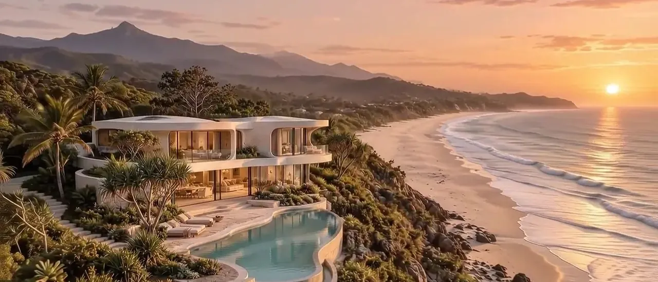
You’ve put real thought into your estate. The architecture. The linen. The way the terrace catches the last light. Nothing about the place feels ordinary. So why should its online presence feel like just another listing?
A booking platform can introduce people to your property. That’s useful. But a listing sits inside somebody else’s shop window, surrounded by alternatives, all squeezed into the same layout.
Your own website does something different. It gives your place room to be itself—and gives interested guests a clear next step.
A listing shows the rooms.
A website can sell the feeling.
Think about how you’d show a friend around. You probably wouldn’t start by reading out the number of bathrooms. You’d open the doors. Point towards the view. Say, “This is where you’ll want your coffee.”
That’s the difference I’m interested in.
A luxury holiday rental website should help someone picture being there. Not through a wall of adjectives, but through the right photographs, useful details and a story that unfolds naturally.
- The long lunch that turns into an evening outside.
- The quiet bedroom away from the rest of the house.
- The walk to the beach before anyone else wakes up.
Those details don’t replace practical information. They give it meaning. A guest still needs to know the layout, sleeping arrangements and price. They just shouldn’t have to imagine the whole experience from a checklist.
Your property has a name.
Give it a home online.
A domain built around your property’s name gives you a consistent address to share: on Instagram, in a conversation, with a local partner or through your own advertising.
Instead of sending everyone straight into a marketplace, you can introduce them to a place that’s entirely about your estate.
There’s space for the things guests actually ask: Is the pool fenced? Which bedrooms are upstairs? Can we bring a dog? How far is the nearest decent coffee?
Answering those questions clearly makes the website useful, not just beautiful. And when someone recommends your place, there’s one simple address to pass on.
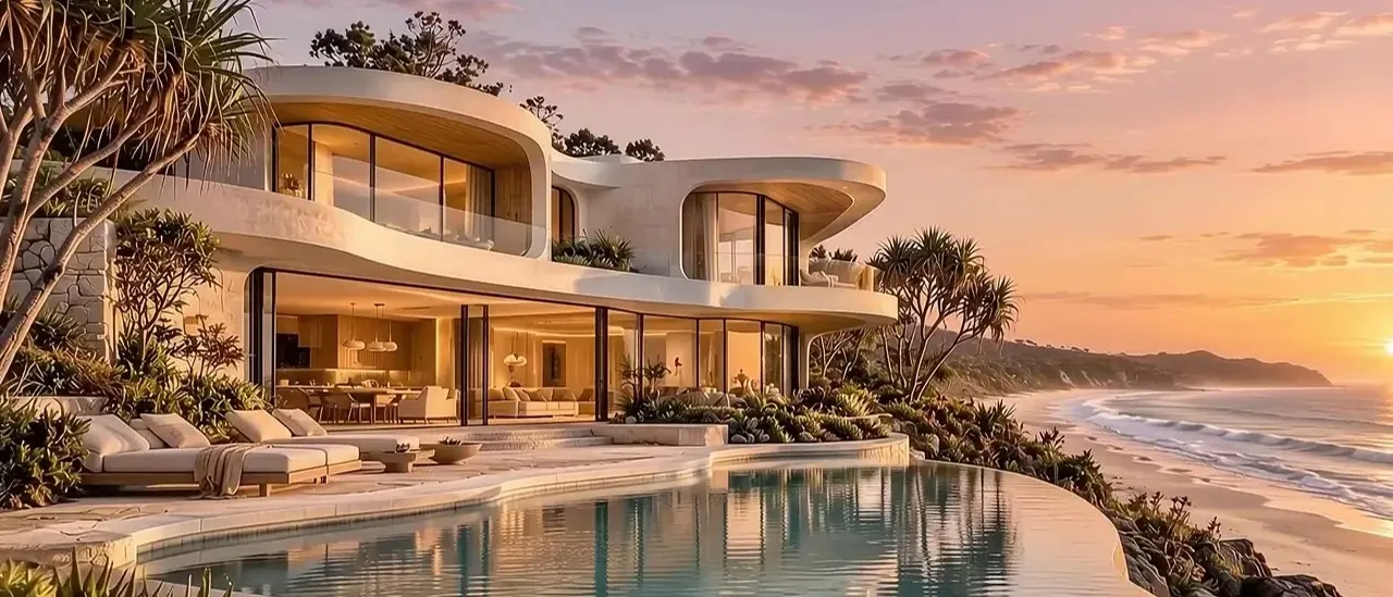
You don’t have to break up
with the booking platforms.
This isn’t an argument for deleting your listings tomorrow. Platforms can remain part of your business. Your website gives you another route for guests who discover you independently.
That distinction matters. Build your own audience through your own marketing. Don’t redirect platform-originated reservations to avoid fees, and check the current terms before using guest details for follow-up.
Direct booking isn’t free, either. There may be card-processing fees, booking software, hosting, marketing costs and applicable taxes or levies. The useful comparison is your total cost—not a platform percentage versus an imaginary zero.
Start with your own numbers. What does an average booking bring in? What does each channel cost? What would a small number of independently acquired bookings contribute after expenses?
You don’t need a grand promise. You need a setup that makes commercial sense for your place.
Beautiful gets their attention.
Clarity helps them decide.
A dramatic opening image is lovely. But eventually someone asks, “Can I trust this, and how do I book?” Your website needs an answer.
That means real property photography, accurate descriptions, clear contact details and reviews you have permission to publish. Cancellation terms, deposits and house rules should be easy to find before anyone pays.
The booking route should be just as straightforward: a supported booking widget, a link to your booking provider, or an enquiry form if that suits your operation.
And it needs to work comfortably on a phone. No tiny text. No hunting for availability. No beautiful animation standing between a guest and the information they came for.
A website shouldn’t become
another job.
You’ve already got a property to run. The goal isn’t to hand you another dashboard and wish you luck.
The starting point is your existing setup. If you use a property management system or booking provider, the website should work with its supported options. Calendar connections need checking, not guessing: plain iCal feeds can lag, and no website alone guarantees against double bookings.
The same honesty applies to search. Clear page titles, descriptive image text, structured information and a sitemap help establish sensible foundations. They don’t guarantee Google rankings or mentions in AI answers.
A good launch is the beginning of your online presence, not a promise that visitors will magically arrive.
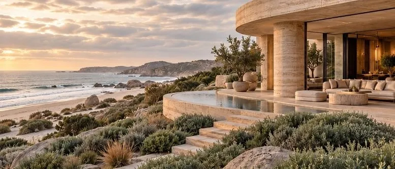
Seven things your own
property website can give you.
This is the thinking behind Sold by Scroll. I build affordable, done-for-you websites for luxury stays, with the property—and the person running it—at the centre.
01. A presentation that feels like your estate
Your photographs, atmosphere and distinctive details shape the experience. A cinematic opening can be created from a suitable property photo, without organising a separate film shoot.
02. A memorable address on your own domain
A clear destination for your marketing and recommendations. Somewhere guests can explore your property without a row of competing stays beside it.
03. A clear route to book or enquire
The next step stays visible, with a booking link, supported integration or enquiry flow matched to how you actually operate.
04. An experience designed for phones
Readable information, considered image sizes and easy-to-reach actions. The design should help guests move forward, not make them work for it.
05. More room to earn trust
Your story, permitted reviews, practical details and policies all have a place. Guests can understand who they’re booking with and what to expect.
06. A foundation for your own marketing
Search basics and consent-based enquiry capture give you something to build on. No guaranteed rankings, no guaranteed booking share—just a useful starting point.
07. One person to talk to
You deal with me, Ivan, from the first conversation through the build. Ongoing hosting and care are available separately, so you don’t have to become the website person.
Let’s give your place
a home of its own.
If your estate already offers something special, its website should help people see it.
I’m Ivan (Ivanski) Kramer, the Australia-based founder of Sold by Scroll. If you’re curious, have a look around the website. We can talk about your property, your current booking setup and whether a dedicated site would be useful.
No need to have it all worked out. That’s what the conversation is for.

Ivan (Ivanski) Kramer
Founder, Sold by Scroll · Australia-based
Affordable, considered websites for extraordinary places.
Editorial note: property imagery is illustrative and supplied for this article, not evidence of completed client projects. Service features depend on the agreed scope and supported third-party systems. Domain registration, booking software and ongoing services may carry separate costs. Search and booking outcomes are not guaranteed.
Further reading: Google’s SEO Starter Guide. Written with clear headings, useful detail and descriptive image text rather than keyword repetition.